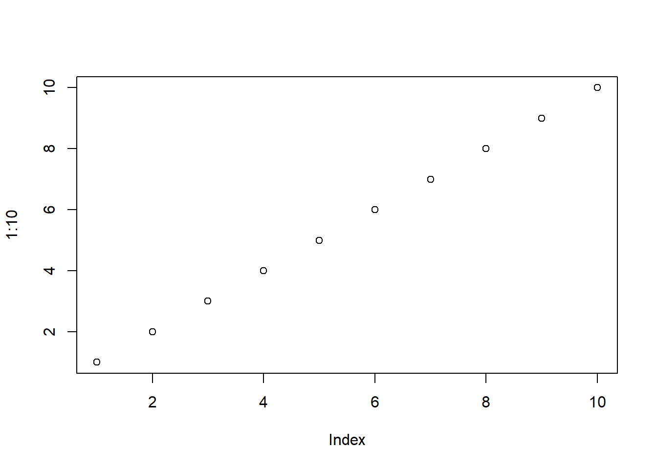
par(mar = c(5, 4, 4, 2) + 0.1)
plot(1:10)
Steven P. Sanderson II, MPH
August 9, 2023
When it comes to data visualization in R, the par() function is an indispensable tool that often goes overlooked. This function allows you to control various graphical parameters, unleashing a world of customization possibilities for your plots. In this blog post, we’ll demystify the par() function, break down its syntax, and provide you with hands-on examples to help you create stunning visualizations.
The par() function stands for “parameters,” and its primary purpose is to modify the graphical parameters of plots in R. Here’s a breakdown of its basic syntax:
The ellipsis (...) represents a sequence of arguments that you can pass to the function. These arguments will determine the changes you want to make to your plots.
In this example, we’re using the mar parameter to control the margins of the plot. The vector c(5, 4, 4, 2) + 0.1 specifies the bottom, left, top, and right margins, respectively. Increasing the margins gives more space for titles, labels, and annotations.
par(col.main = "blue", col.axis = "red")
plot(1:10, main = "Custom Colors", xlab = "X-axis", ylab = "Y-axis")
Here, we’re utilizing col.main and col.axis to change the color of the main title and axis labels. This adds a touch of vibrancy to your plots and enhances readability.
With cex.main and cex.axis, you can control the size of the main title and axis labels, respectively. This allows you to emphasize important information and fine-tune the presentation.
Warning in par(log = "y"): "log" is not a graphical parameter
By setting log = "y", you’re instructing R to use a logarithmic scale for the y-axis. This is particularly useful when dealing with data that spans several orders of magnitude.
Don’t just stop at these examples! The true power of the par() function lies in experimentation. Tweak the arguments, combine them, and watch your plots transform. Feel free to explore other parameters, such as bg, lwd, and pch, to further customize line colors, line widths, and point shapes.
In conclusion, the par() function in R is your gateway to creating visually stunning plots that effectively communicate your data insights. By understanding its syntax and harnessing its potential through hands-on practice, you’ll be well-equipped to take your data visualization skills to the next level. So, why wait? Dive in, experiment, and let your creativity shine through your plots!