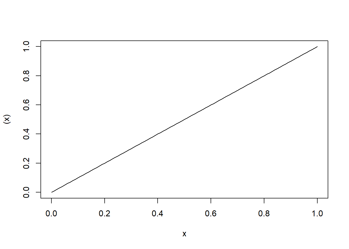
curve((x))
Steven P. Sanderson II, MPH
August 16, 2023
In the vast world of R programming, there are numerous functions that provide powerful capabilities for data visualization and analysis. One such function that often goes under appreciated is the curve() function. This neat little function allows us to plot mathematical functions and explore their behavior. In this blog post, we will dive into the syntax of the curve() function, provide a couple of examples to demonstrate its usage, and encourage readers to try it on their own.
curve() function:The curve() function in R is used to draw a curve corresponding to a function over a specified interval. The basic syntax of the curve() function is as follows:
where:
expr: This is the expression that defines the function to be plotted.from: This is the lower bound of the x-axis.to: This is the upper bound of the x-axis.n: This is the number of points to use to plot the curve.type: This is the type of line to use to plot the curve. The default value is “l”, which plots a solid line. Other possible values include “o” (points), “h” (histogram-like), and “s” (stairs).xname: This is the name of the x-axis. The default value is “x”.yname: This is the name of the y-axis. The default value is “y”....: This is a placeholder for other arguments that can be passed to the curve() function. For example, you can use the col argument to specify the color of the line, and the lty argument to specify the line type.Let’s start with a simple example to plot a line. Suppose we want to plot the line y = x. We can achieve this using the curve() function as follows:
In this example, we provide the expression (x) to the curve() function. The expression (x) represents the line y = x. By default, the curve() function will plot the curve between 0 and 1. The resulting plot will show a straight line passing through the origin with a slope of 1.
The curve() function allows us to overlay multiple curves on the same plot. Let’s consider an example where we plot several curves together:
curve((x), from = -2, to = 2, lwd = 2)
curve(0 * x, add = TRUE, col = "blue")
curve(0 * x + 1.5, add = TRUE, col = "green")
curve(x^3, add = TRUE, col = "red")
curve(-3 * (x + 2), add = TRUE, col = "orange")
In this example, we first plot the line y = x with a thicker line width (lwd = 2). Then, we overlay four additional curves on the same plot: a horizontal line at y = 0 (colored blue), a horizontal line at y = 1.5 (colored green), a cubic curve y = x^3 (colored red), and a linear curve y = -3(x + 2) (colored orange). This example showcases the versatility of the curve() function in visualizing multiple functions simultaneously.
Let’s start with a simple example. Suppose we want to visualize the curve of the quadratic function f(x) = x^2. Here’s how we can achieve this using the curve() function:
curve(x^2, from = -5, to = 5, type = "l", col = "blue",
      xlab = "x-axis", ylab = "y = x^2",
      main = "Quadratic Curve: y = x^2")
In this example, we’ve provided the expression x^2 to the curve() function. We’ve also specified the range of x-values from -5 to 5. The curve type is set to “l” for lines, and we’ve customized the colors, labels, and title of the plot.
Now, let’s take it up a notch and visualize two functions on the same plot. Imagine we want to compare the curves of the sine and cosine functions. Here’s how we can do it:
curve(sin(x), from = -2 * pi, to = 2 * pi, type = "l", col = "red",
      xlab = "x-axis", ylab = "y-axis",
      main = "Sine and Cosine Curves")
curve(cos(x), from = -2 * pi, to = 2 * pi, type = "l", col = "blue",
      add = TRUE)
legend("topright", legend = c("sin(x)", "cos(x)"),
       col = c("red", "blue"), lty = 1)
In this example, we’ve plotted both the sine and cosine functions on the same plot. By setting add = TRUE in the second curve() call, we overlay the cosine curve on the existing plot. We’ve also added a legend to differentiate between the two curves.
The curve() function in R is a powerful tool for plotting mathematical functions. In this blog post, we explored the syntax of the curve() function and provided a couple of examples to demonstrate its usage. We encourage readers to try out the curve() function on their own and explore the fascinating world of mathematical visualization in R. Happy coding!