Plotting Multiple Lines on a Graph in R: A Step-by-Step Guide
rtip
viz
Author
Steven P. Sanderson II, MPH
Published
August 24, 2023
Introduction
Graphs are powerful visual tools for analyzing and presenting data. In this blog post, we will explore how to plot multiple lines on a graph using base R. We will cover two methods: matplot() and lines(). These functions provide flexibility and control over the appearance of the lines, allowing you to create informative and visually appealing plots. So, let’s dive in and learn how to plot multiple lines on a graph in R!
Examples
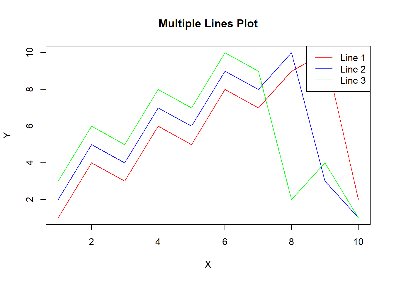
Example 1 Using matplot():
The matplot() function is a convenient way to plot multiple lines in one chart when you have a dataset in a wide format. Here’s an example:
We first create sample data for the x-axis (x) and three lines (y1, y2, y3).
The matplot() function is then used to plot the lines. We pass the x-axis values (x) and a matrix of y-axis values (cbind(y1, y2, y3)) as input.
The type = "l" argument specifies that we want to plot lines.
The lty = 1 argument sets the line type to solid.
The col argument specifies the colors of the lines.
The xlab, ylab, and main arguments set the labels for the x-axis, y-axis, and the main title of the plot, respectively.
Finally, the legend() function is used to add a legend to the plot, indicating the colors and labels of the lines.
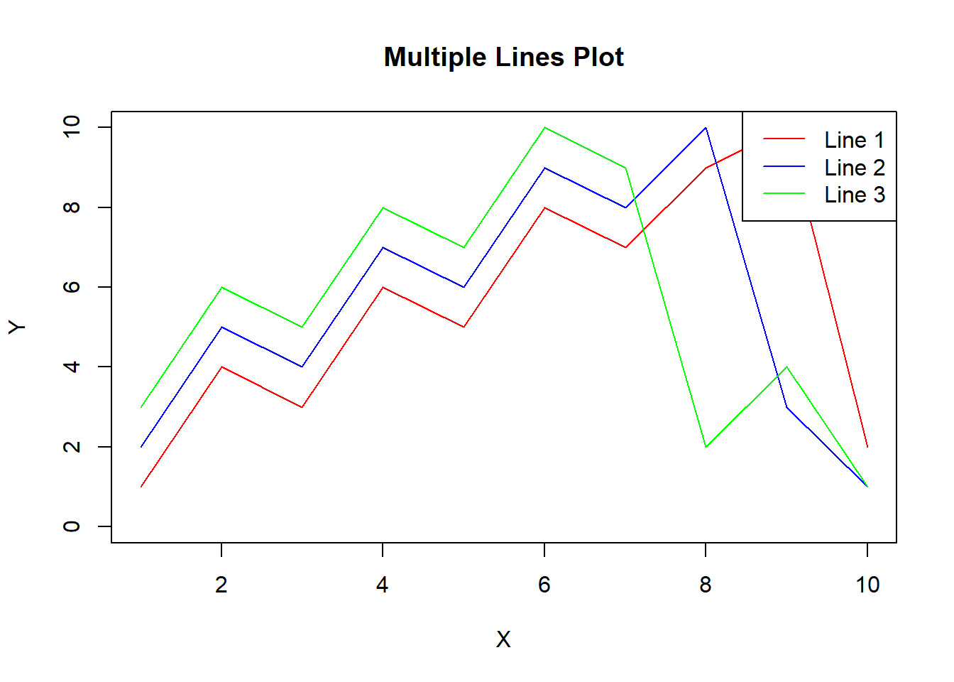
Example 2 Using lines():
Another way to plot multiple lines is to plot them one by one using the points() and lines() functions. Here’s an example:
# Create sample datax <-1:10y1 <-c(1, 4, 3, 6, 5, 8, 7, 9, 10, 2)y2 <-c(2, 5, 4, 7, 6, 9, 8, 10, 3, 1)y3 <-c(3, 6, 5, 8, 7, 10, 9, 2, 4, 1)# Create an empty plotplot(x, y1, type ="n", xlim =c(1, 10), ylim =c(0, 10), xlab ="X", ylab ="Y", main ="Multiple Lines Plot")# Plot each line one by onelines(x, y1, type ="l", col ="red")lines(x, y2, type ="l", col ="blue")lines(x, y3, type ="l", col ="green")# Add a legendlegend("topright", legend =c("Line 1", "Line 2", "Line 3"), col =c("red", "blue", "green"), lty =1)
Explanation
We create the same sample data as in the previous example.
The plot() function is used to create an empty plot with appropriate labels and limits.
We then use the lines() function to plot each line one by one. The type = "l" argument specifies that we want to plot lines, and the col argument sets the color of each line.
Finally, the legend() function is used to add a legend to the plot.
Conclusion
In this blog post, we explored two methods for plotting multiple lines on a graph using base R: matplot() and lines(). We provided step-by-step examples and explained the code in simple terms. We encourage you to try these methods on your own datasets and experiment with different customization options. By mastering these techniques, you will be able to create visually appealing and informative plots in R. Happy plotting!