library(ggplot2)

# Create a barplot using geom_bar()
ggplot(data = iris, aes(x = Species, fill = factor(Species))) +
  geom_bar() +
  theme_minimal() +
  labs(
    title = "Bar Chart of Species Count",
    ylab = "Count",
    fill = "Species"
  )
Steven P. Sanderson II, MPH
August 29, 2023
Categorical data is a type of data that represents distinct groups or categories. Visualizing categorical data can provide valuable insights and help in understanding patterns and relationships within the data. In this blog post, we will explore three popular charts for visualizing categorical data in R using the iris dataset: geom_bar() from ggplot2, a grouped boxplot with base R and ggplot2, and a mosaic plot. We will explain each section of code in simple terms and encourage readers to try these charts on their own.
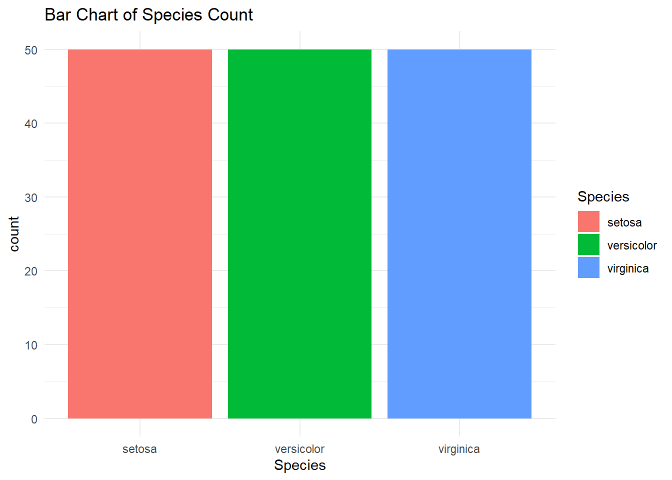
Barplots are a common and effective way to visualize categorical data. We can use the geom_bar() function from the ggplot2 package to create barplots in R. The geom_bar() function accepts a variable for the x-axis and plots the number of times each value of the variable appears in the dataset[3].
library(ggplot2)
# Create a barplot using geom_bar()
ggplot(data = iris, aes(x = Species, fill = factor(Species))) +
geom_bar() +
theme_minimal() +
labs(
title = "Bar Chart of Species Count",
ylab = "Count",
fill = "Species"
)
Explanation: - Load the ggplot2 package using library(ggplot2). - The iris dataset is already available in R, so we can directly use it. - The aes() function specifies the aesthetic mappings, where x represents the variable on the x-axis. - The geom_bar() function creates the barplot.
Try creating a barplot with the Species variable from the iris dataset using the provided code. Experiment with different variables and datasets to explore the patterns and distributions within your data.
A grouped boxplot is a useful chart for comparing the distribution of a continuous variable across different categories of a categorical variable. We can create a grouped boxplot using both base R and ggplot2.
# Create a grouped boxplot using ggplot2
ggplot(data = iris, aes(x = Species, y = Sepal.Length,
                        fill = factor(Species))) +
  geom_boxplot() +
  theme_minimal() +
  labs(fill = "Species")
Explanation: - In base R, we use the boxplot() function to create a grouped boxplot. The formula Sepal.Length ~ Species specifies that the Sepal.Length variable should be plotted against the Species variable[2]. - In ggplot2, we use the geom_boxplot() function to create a grouped boxplot. The aes() function specifies the aesthetic mappings, where x represents the categorical variable and y represents the numeric variable.
Create a grouped boxplot with the Sepal.Length variable across different species in the iris dataset using either base R or ggplot2. Compare the distributions of Sepal.Length for each species and observe any differences.
A mosaic plot is a graphical representation of the relationship between two or more categorical variables. It displays the proportions of each category within the variables and allows for visual comparison.
Explanation: - The table() function creates a contingency table of the two variables, Species and Petal.Width, from the iris dataset. - The mosaicplot() function creates the mosaic plot.
Create a mosaic plot with the Species and Petal.Width variables from the iris dataset using the provided code. Explore the relationships and proportions between the variables. Experiment with different combinations of variables to gain insights from the mosaic plot.
Visualizing categorical data is essential for understanding patterns and relationships within the data. In this blog post, we explored three engaging charts for visualizing categorical data in R using the iris dataset: geom_bar() from ggplot2, a grouped boxplot with base R and ggplot2, and a mosaic plot. We explained each section of code in simple terms and encouraged readers to try these charts on their own. By experimenting with these charts, readers can gain valuable insights from their own categorical data and make informed decisions based on the visualizations.
Happy plotting!