install.packages("ggplot2")Introduction
When it comes to conveying information effectively, data visualization is a powerful tool that can make complex data more accessible and understandable. One captivating type of data visualization is the lollipop chart. Lollipop charts are a great way to showcase and compare data points while adding a touch of elegance to your presentations. In this blog post, we will dive into what lollipop charts are, why they are useful, and how you can create your own stunning lollipop charts using the ggplot2 package in R.
What are Lollipop Charts?
Lollipop charts, also known as dot plot charts, combine elements of bar charts and scatter plots to visualize data in a unique and engaging manner. They consist of a set of data points represented by circles (or any chosen shape) positioned at the end of a vertical line. These lines serve as the reference point for each data value, making it easy to compare values across categories or groups.
The primary advantage of lollipop charts is their simplicity and efficiency in highlighting individual data points. This makes them particularly useful when you want to emphasize specific data values in your dataset or when you have a relatively small number of data points to display.
When to Use Lollipop Charts
Lollipop charts are particularly effective in the following scenarios:
1. Comparing Data Points:
Lollipop charts excel at highlighting individual data points and comparing their values. When you want to showcase the differences between distinct values, a lollipop chart can provide a clear visual representation.
2. Showing Distribution:
Lollipop charts can also be used to display the distribution of data points. By placing lollipops along an axis, you can provide insights into the range and distribution of your data.
3. Emphasizing Outliers:
If your data contains outliers that you want to draw attention to, lollipop charts can be a fantastic choice. Outliers can be visually distinguished from the rest of the data, aiding in spotting anomalies.
4. Limited Data Points:
When you’re working with a small dataset, a lollipop chart can be more effective than a bar chart, which might appear overly crowded for a few data points.
Creating Lollipop Charts using ggplot2
Now, let’s roll up our sleeves and create our own lollipop charts using the popular ggplot2 package in R. But first, make sure you have ggplot2 installed by running:
Once you have ggplot2 installed, you can create a custom function, lollipop_chart(), to generate lollipop charts with ease. Here’s how you can define the function:
library(ggplot2)
library(dplyr)

lollipop_chart <- function(.data, x, y, title) {
  x_var <- rlang::enquo(x)
  y_var <- rlang::enquo(y)

  .data |>
  ggplot(aes(x = {{ x_var }}, y = {{ y_var }})) +
    geom_segment(aes(x = {{ x_var }}, xend = {{ x_var }},
                     y = 0, yend = {{ y_var }}),
                 color = "gray50") +
    geom_point(size = 3, color = "steelblue") +
    labs(title = title, x = "", y = "") +
    theme_minimal() +
    theme(panel.grid.major.y = element_blank())
}
Let’s break down the components of the lollipop_chart() function: - data: The dataset containing the data points. - x: The variable on the x-axis (categorical or ordinal). - y: The variable on the y-axis (numeric). - title: The title of the chart.
Examples of Lollipop Charts
Example 1: Top Movies’ IMDb Ratings
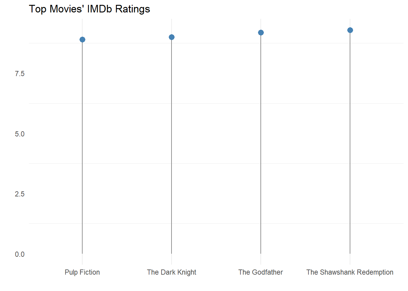
Suppose we have a dataset containing the top-rated movies and their IMDb ratings. We can use a lollipop chart to visualize these ratings:
movies <- tibble(
  Movie = c("The Shawshank Redemption", "The Godfather", "The Dark Knight", "Pulp Fiction") |> factor(),
  Rating = c(9.3, 9.2, 9.0, 8.9)
)

lollipop_chart(movies, Movie, Rating, "Top Movies' IMDb Ratings")
Example 2: Exam Scores Comparison
Consider a scenario where we want to compare the scores of students from two different classes. A lollipop chart can effectively illustrate the differences:
exam_scores <- data.frame(
  Class = rep(c("Class A", "Class B"), each = 5),
  Student = c("Alice", "Bob", "Carol", "David", "Emma", "Frank", "Grace", "Hannah", "Ivan", "Jack") |> factor(),
  Score = c(85, 78, 92, 67, 75, 88, 82, 95, 70, 79)
)

lollipop_chart(exam_scores, Student, Score, "Exam Scores Comparison")
Try Lollipop Charts Yourself!
Lollipop charts provide an engaging way to display and compare data points while highlighting key insights. With the ggplot2 package in R, you have the tools to create stunning lollipop charts for your own datasets. Experiment with different datasets and customize the appearance of your charts to suit your needs. Happy charting!
In this blog post, we explored what lollipop charts are, when to use them, and how to create them using the ggplot2 package in R. We provided examples of real-world scenarios where lollipop charts can be valuable and even shared a custom lollipop_chart() function to streamline the chart creation process. Now it’s your turn to apply this knowledge and create captivating lollipop charts with your own data!