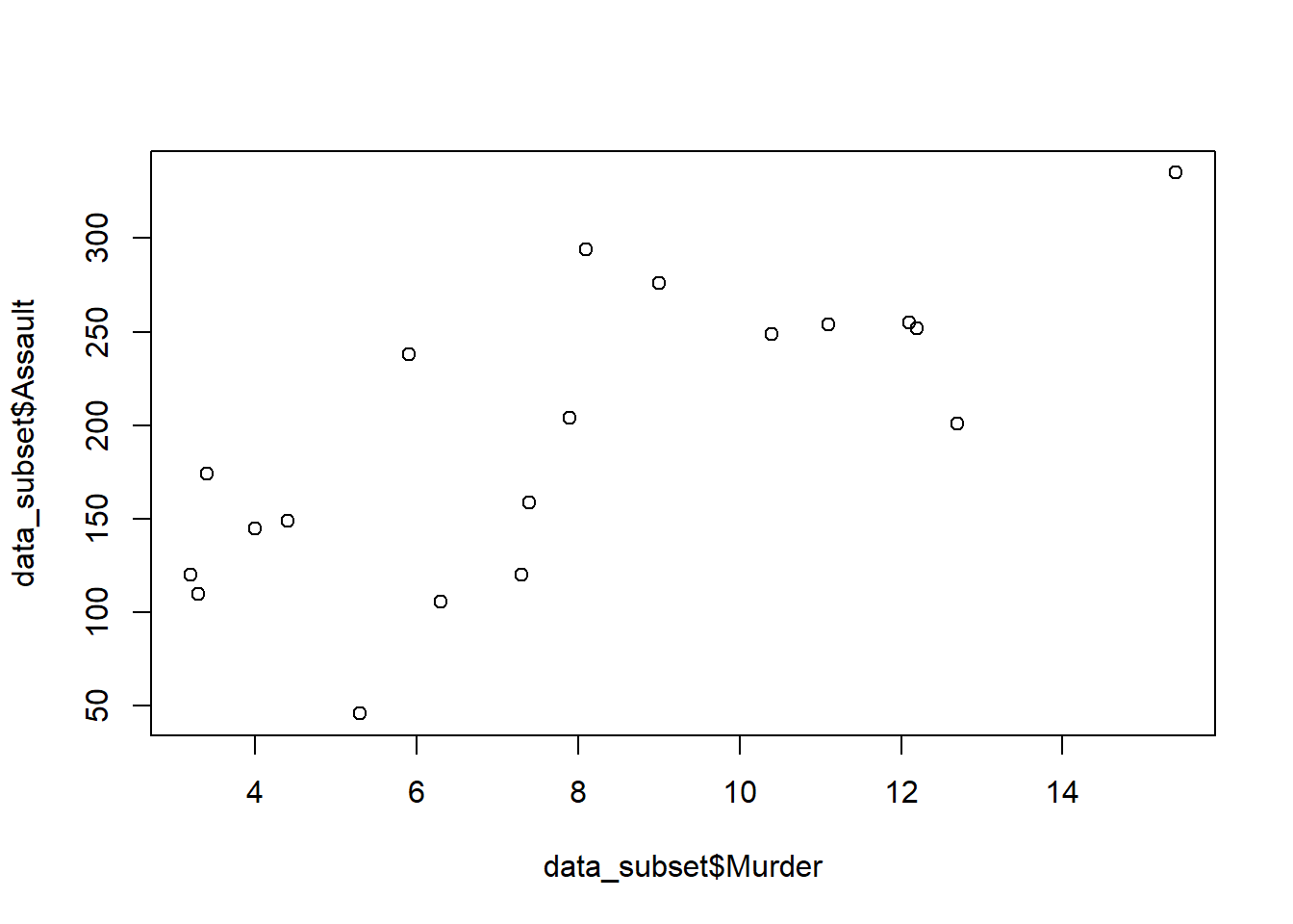
data_subset <- subset(USArrests, UrbanPop > 70)
plot(data_subset$Murder, data_subset$Assault)
Steven P. Sanderson II, MPH
September 7, 2023
Data visualization is a powerful tool for gaining insights from your data. In R, you have a plethora of libraries and functions at your disposal to create stunning and informative plots. One common task is to plot a subset of your data, which allows you to focus on specific aspects or trends within your dataset. In this blog post, we’ll explore various techniques to plot subsets of data in R, and I’ll explain each step in simple terms. Don’t worry if you’re new to R – by the end of this post, you’ll be equipped to create customized plots with ease!
Before we start, make sure you have R and RStudio installed on your computer. If not, you can download them from R’s official website and RStudio’s website.
Suppose you have a dataset of monthly sales, and you want to plot only the data points where sales exceeded $10,000. Here’s how you can do it:
# Load your data (replace 'your_data.csv' with your actual file)
data <- read.csv("your_data.csv")

# Create a subset based on the condition
subset_data <- data[data$Sales > 10000, ]

# Create a scatter plot
plot(subset_data$Month, subset_data$Sales,
     main="Monthly Sales > $10,000",
     xlab="Month", ylab="Sales")
Explanation: - We load the data from a CSV file into the ‘data’ variable. - Next, we create a subset of the data using a condition (in this case, sales > $10,000) and store it in ‘subset_data.’ - Finally, we create a scatter plot using the ‘plot’ function, specifying the x-axis (‘Month’) and y-axis (‘Sales’), and adding labels to the plot.
Sometimes you might want to plot a random subset of your data. Let’s say you have a large dataset of customer reviews, and you want to visualize a random sample of 100 reviews:
# Load your data (replace 'your_data.csv' with your actual file)
data <- read.csv("your_data.csv")

# Create a random subset
set.seed(123)  # For reproducibility
sample_data <- data[sample(nrow(data), 100), ]

# Create a bar plot of review ratings
barplot(table(sample_data$Rating),
        main="Random Sample of Customer Reviews",
        xlab="Rating", ylab="Count")
Explanation: - We load the data as before. - Using the sample function, we select 100 random rows from the dataset while setting the seed for reproducibility. - Then, we create a bar plot to visualize the distribution of review ratings.
Suppose you have a dataset containing information about various products and you want to plot the sales for each product category. Here’s how you can do it:
# Load your data (replace 'your_data.csv' with your actual file)
data <- read.csv("your_data.csv")

# Create a bar plot of sales by category
barplot(tapply(data$Sales, data$Category, sum),
        main="Sales by Product Category",
        xlab="Category", ylab="Total Sales")
Explanation: - We load the data. - Using the tapply function, we group the data by ‘Category’ and calculate the sum of ‘Sales’ for each category. - Finally, we create a bar plot to visualize the total sales for each product category.
Now for some worked out examples.
In this method, first, a subset of the data is created based on some condition, and then it is plotted using the plot function. Let us first create the subset of the data.
In the above code, we have created a subset of the USArrests dataset where UrbanPop is greater than 70. Then we have plotted the Murder and Assault columns of the subset using the plot function.
Using the ‘[ ]’ operator, elements of vectors and observations from data frames can be accessed and subsetted based on some condition.
In the above code, we have used the [ ] operator to subset the USArrests dataset where UrbanPop is greater than 70. Then we have plotted the Murder and Assault columns of the subset using the plot function.
In this method, we pass the row and column attributes to the plot function to plot a subset of the data.
In the above code, we have used the row and column attributes to subset the USArrests dataset where UrbanPop is greater than 70. Then we have plotted the Murder and Assault columns of the subset using the plot function.
The dplyr package provides a simple and efficient way to subset data.
Attaching package: 'dplyr'The following objects are masked from 'package:stats':
filter, lagThe following objects are masked from 'package:base':
intersect, setdiff, setequal, union
In the above code, we have used the filter function from the dplyr package to subset the USArrests dataset where UrbanPop is greater than 70. Then we have plotted the Murder and Assault columns of the subset using the plot function.
In conclusion, there are several ways to plot a subset of data in R. We have explored four methods in this blog post. I encourage readers to try these methods on their own and explore other ways to subset and plot data in R.
In this blog post, we’ve explored different techniques for plotting subsets of data in R. Whether you want to filter data based on conditions, create random samples, or visualize data by categories, R provides you with the tools to do so. Don’t be afraid to experiment and tailor these examples to your own datasets. The more you practice, the more proficient you’ll become in data visualization with R. Happy coding!