# Create data for a simple surface plot
x <- seq(-5, 5, length.out = 50)
y <- seq(-5, 5, length.out = 50)
z <- outer(x, y, function(x, y) cos(sqrt(x^2 + y^2)))

# Create a 3D surface plot
persp(x, y, z, col = "lightblue", border = "black")
Steven P. Sanderson II, MPH
September 12, 2023
If you’re an R enthusiast looking to take your data visualization to the next level, you’re in for a treat. In this blog post, we’re going to dive into the world of 3D plotting using R’s powerful persp() function. Whether you’re visualizing surfaces, mathematical functions, or complex data, persp() is a versatile tool that can help you create stunning three-dimensional plots.
The persp() function in R stands for “perspective plot,” and it’s part of the base graphics package. It allows you to create three-dimensional surface plots by representing a matrix of heights or values as a surface, with the x and y coordinates defining the grid and the z coordinates representing the height of the surface at each point.
Before we dive into examples, let’s take a look at the basic syntax of the persp() function:
x, y, and z are the vectors or matrices representing the x, y, and z coordinates of the data points.theta and phi control the orientation of the plot. theta sets the azimuthal angle (rotation around the z-axis), and phi sets the polar angle (rotation from the xy-plane). These angles are in degrees.col and border control the color of the surface and its border, respectively.scale is a logical value that determines whether the axes should be scaled to match the data range.... to customize the plot further.Now, let’s jump into some examples to see how persp() works in action!
# Create data for a simple surface plot
x <- seq(-5, 5, length.out = 50)
y <- seq(-5, 5, length.out = 50)
z <- outer(x, y, function(x, y) cos(sqrt(x^2 + y^2)))
# Create a 3D surface plot
persp(x, y, z, col = "lightblue", border = "black")
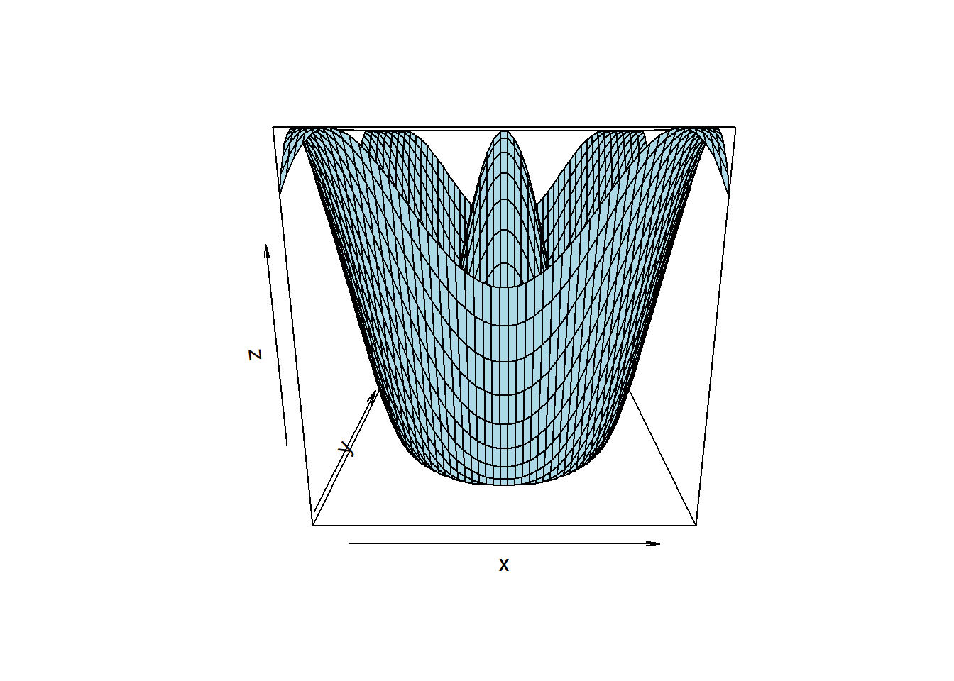
In this example, we generate a grid of x and y values and calculate the corresponding z values based on a mathematical function. The persp() function then creates a 3D surface plot, using the provided x, y, and z data.
# Create data for a surface plot
x <- seq(-10, 10, length.out = 100)
y <- seq(-10, 10, length.out = 100)
z <- outer(x, y, function(x, y) 2 * sin(sqrt(x^2 + y^2)) / sqrt(x^2 + y^2))

# Create a customized 3D surface plot
persp(x, y, z, col = "lightblue", border = "black", theta = 60, phi = 20)
In this example, we create a similar surface plot but customize the perspective by changing the theta and phi angles. This gives the plot a different orientation, providing a unique view of the data.
# Create data for a surface plot
x <- seq(-2, 2, length.out = 50)
y <- seq(-2, 2, length.out = 50)
z <- outer(x, y, function(x, y) exp(-x^2 - y^2))

# Create a 3D surface plot with scaled axes
persp(x, y, z, col = "lightblue", border = "black", scale = TRUE)
Here, we enable axis scaling with the scale parameter, which ensures that the x, y, and z axes are scaled to match the data range.
# Create data
x <- seq(-10, 10, length.out = 50)
y <- seq(-10, 10, length.out = 50)
z1 <- outer(x, y, function(x, y) dnorm(sqrt(x^2 + y^2)))
z2 <- outer(x, y, function(x, y) dnorm(sqrt((x-2)^2 + (y-2)^2)))
z3 <- outer(x, y, function(x, y) dnorm(sqrt((x+2)^2 + (y+2)^2)))

# Plot data
par(mfrow = c(1, 3))

persp(x, y, z1, theta = 30, phi = 30, col = "lightblue", border = NA, shade = 0.5, ticktype = "detailed", nticks = 5, xlab = "X", ylab = "Y", zlab = "Z1")
persp(x, y, z2, theta = 30, phi = 30, col = "lightblue", border = NA, shade = 0.5, ticktype = "detailed", nticks = 5, xlab = "X", ylab = "Y", zlab = "Z2")
persp(x, y, z3, theta = 30, phi = 30, col = "lightblue", border = NA, shade = 0.5, ticktype = "detailed", nticks = 5, xlab = "X", ylab = "Y", zlab = "Z3")
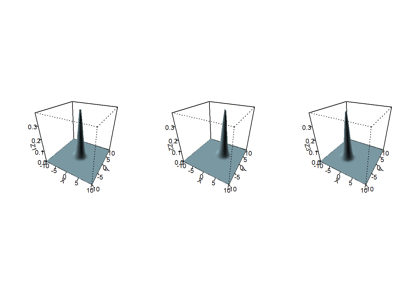
In this example, we create data for three different Gaussian distributions. We define the x- and y-axes and use the outer() function to calculate the z-values based on the normal distribution. We then use the persp() function to plot the data. We set the color to light blue, the border to NA, and the shading to 0.5. We also set the tick type to detailed and the number of ticks to 5. Finally, we label the x-, y-, and z-axes. We use the par() function to create multiple 3D plots in one figure.
Now that you’ve seen some examples of what the persp() function can do, it’s time to try it out on your own data or mathematical functions. Experiment with different perspectives, colors, and data sources to create captivating 3D plots that visualize your information in a whole new dimension.
Remember, the best way to learn is by doing. So, fire up R, load your data, and start exploring the third dimension with persp(). Happy plotting!