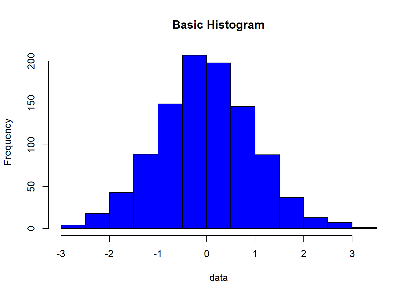
# Generate some example data
data <- rnorm(1000)

# Create a basic histogram with a single color (e.g., blue)
hist(data, col = "blue", main = "Basic Histogram")
Steven P. Sanderson II, MPH
September 14, 2023
Histograms are a fantastic way to visualize the distribution of data. They provide insights into the underlying patterns and help us understand our data better. But what if you want to add some color to your histograms to make them more visually appealing or to highlight specific data points? In this blog post, we’ll explore how to create histograms with different colors in R, and we’ll provide several examples to guide you through the process.
Color can be a powerful tool for data visualization. By adding color to your histograms, you can:
Emphasize specific data points: Highlighting certain parts of your distribution can make it easier for viewers to focus on what’s important.
Improve aesthetics: Adding color can make your charts more visually appealing, making them suitable for presentations and reports.
Enhance readability: Different colors can help distinguish between multiple histograms on the same plot or separate data categories.
Now, let’s dive into some R code to create colorful histograms.
Let’s start with the basics. To create a simple histogram with a single color, we’ll use the built-in hist() function and then customize it with the col parameter:
# Generate some example data
data <- rnorm(1000)
# Create a basic histogram with a single color (e.g., blue)
hist(data, col = "blue", main = "Basic Histogram")
In this example, we generated 1000 random data points and created a histogram with blue bars. You can replace "blue" with any valid color name or code you prefer.
Sometimes, you might want to use different colors for individual bins in your histogram. Here’s how you can achieve that:
# Generate example data
data <- rnorm(100)

# Define custom colors for each bin
bin_colors <- c("red", "green", "blue", "yellow", "purple")

# Create a histogram with custom bin colors
hist(data, breaks = 5, col = bin_colors, main = "Custom Bin Colors")
In this example, we’ve specified five custom colors for our histogram’s bins, creating a colorful representation of the data distribution.
You may also want to compare multiple data distributions in a single histogram. To do this, you can overlay histograms with different colors. Here’s an example:
# Generate two sets of example data
data1 <- rnorm(1000, mean = 0, sd = 1)
data2 <- rnorm(1000, mean = 2, sd = 1)

# Create histograms for each dataset and overlay them
hist(data1, col = "blue", main = "Overlayed Histograms")
hist(data2, col = "red", add = TRUE)
legend("topright", legend = c("Data 1", "Data 2"), fill = c("blue", "red"))
In this example, we generated two datasets and overlaid their histograms with different colors. The alpha parameter controls the transparency of the bars, making it easier to see overlapping areas.
Now that you’ve seen how to create histograms with different colors in R, I encourage you to experiment with your own datasets and colors. R provides numerous options for customizing your histograms, so you can tailor them to your specific needs. Play around with colors, transparency, and other graphical parameters to create engaging and informative visualizations.
Remember, the best way to learn is by doing, so fire up your R environment and start creating colorful histograms today!