library(TidyDensity)

data <- tidy_multi_single_dist(
  .tidy_dist = "tidy_normal",
  .param_list = list(
    .n = 100,
    .mean = c(-2, 0, 2),
    .sd = 1,
    .num_sims = 5
    )
)Introduction
Data visualization is a crucial tool in the data scientist’s toolkit. It allows us to explore and communicate complex patterns and insights effectively. In the world of R programming, one of the most powerful and versatile packages for data visualization is ggplot2. Among its many features, ggplot2 offers the facet_grid() function, which enables you to create multiple plots arranged in a grid, making it easier to visualize different groups of data simultaneously.
In this blog post, we’ll dive into the fascinating world of facet_grid() using a practical example. We’ll generate some synthetic data, split it into multiple groups, and then use facet_grid() to create a visually appealing grid of plots.
Generating Synthetic Data
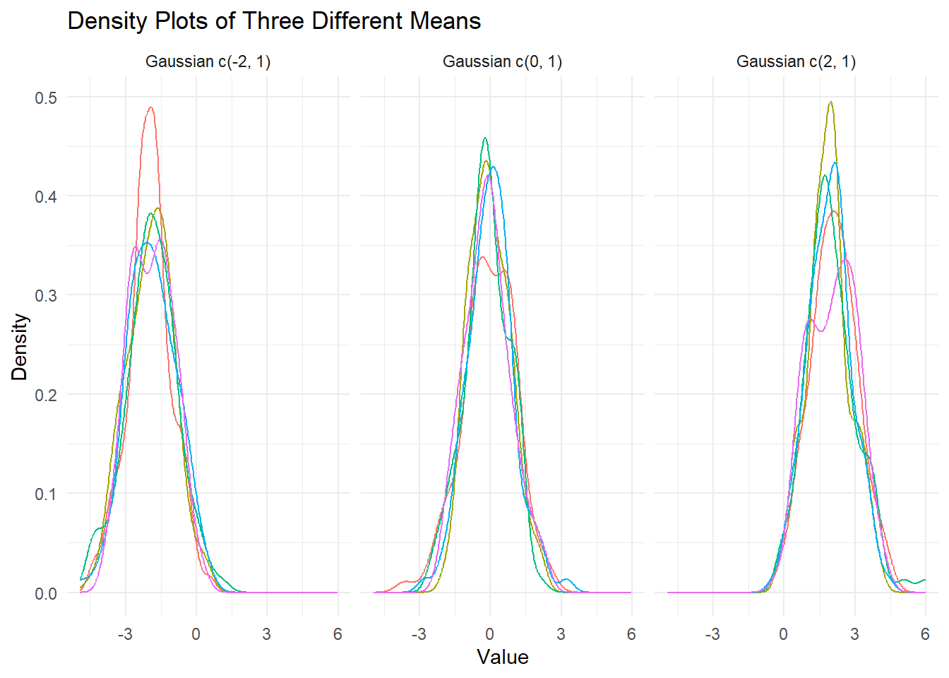
Let’s start by generating some synthetic data using the TidyDensity package in R. We’ll create three groups of data, each with 100 observations, and a mean of -2, 0, and 2, respectively, all with a standard deviation of 1. We’ll also perform this simulation five times to create a diverse dataset.
Now that we have our data, it’s time to visualize it using facet_grid().
Using facet_grid() to Visualize Multiple Groups
The facet_grid() function in ggplot2 is a versatile tool for creating a grid of plots based on one or more categorical variables. It allows you to create small multiples, which are a series of similar plots, each showing a subset of your data.
In our synthetic data, we have three groups (mean of -2, 0, and 2), and we want to visualize each group’s distribution. Here’s how you can do it:
# Create a ggplot object
# Load ggplot2
library(ggplot2)

# Create a ggplot object
p <- ggplot(data, aes(x = y, color = sim_number, group = sim_number)) +
  geom_density(alpha = 0.5) +
  facet_wrap(. ~ dist_name)

# Customize the plot
p + labs(title = "Density Plots of Three Different Means",
         x = "Value",
         y = "Density") +
  theme_minimal() +
  theme(legend.position = "none")
In this code:
We load the
ggplot2package, which is essential for creating our plots.We create a ggplot object
pwhere we specify the aesthetics (x-axis, fill color) and the geometry (density plot). We usefacet_grid(. ~ simulation)to split the data into separate facets based on thesimulationvariable. This means that each facet will represent one of the five simulations.We add labels and customize the plot’s appearance using the
labs()andtheme_minimal()functions.Finally, we display the plot by evaluating
p.
The resulting plot will show a grid of density plots, with each facet representing one simulation. Within each facet, you’ll see the density distribution of the data, colored by the group mean.
Conclusion
In this blog post, we explored the power of ggplot2’s facet_grid() function for visualizing multiple groups of data. By generating synthetic data and using ggplot2, we created an informative grid of density plots, allowing us to compare and contrast the distributions of different groups.
The ability to create small multiples with facet_grid() is invaluable for gaining insights from complex datasets. Whether you’re working with synthetic data or real-world data, mastering ggplot2’s facet_grid() function will enhance your data visualization skills and help you communicate your findings more effectively.
So, go ahead and experiment with your data. Create your own grid of plots using facet_grid() and unlock new ways to visualize and understand your data. Happy plotting!