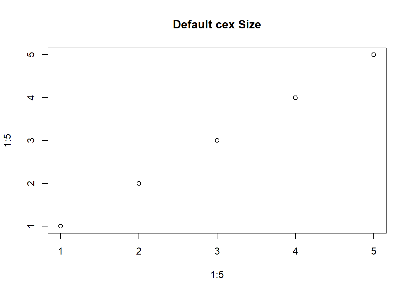
# Create a scatter plot
plot(1:5, 1:5, main="Default cex Size")
# Change the text size with cex
plot(1:5, 1:5, main="Larger cex", cex=1.5)
Steven P. Sanderson II, MPH
October 12, 2023
Let’s dive into the world of R and explore how to use cex to change the size of plot elements in base R. Whether you’re a seasoned R user or just starting out, understanding how to control the size of text and symbols in your plots can greatly enhance the clarity and aesthetics of your data visualizations. In this blog post, we’ll break it down into simple terms and provide several examples to get you started.
cex stands for “character expansion.” It’s a parameter in R that allows you to adjust the size of text, symbols, and other graphical elements within your plots. You can think of it as a scaling factor that determines the size of these elements relative to the default size.
Let’s start with the basics. The cex parameter is typically used within functions that create plots, like plot() or text(). It takes a numeric value, where 1.0 represents the default size, and values greater than 1 make elements larger, while values between 0 and 1 make elements smaller.
Here’s a simple example of changing the size of text in a scatter plot:


In the second plot() call, we set cex to 1.5, making the text 1.5 times larger than the default size. Play around with different cex values to see the effect on your plots.
cex is particularly handy when you want to adjust the size of text labels in your plots. For example, when creating a bar plot, you might want to make the bar labels more legible:

# Change the label size with cex
barplot(1:5, names.arg=c("A", "B", "C", "D", "E"), main="Larger Labels", cex.names=1.5)
In the second barplot() call, we use cex.names to specifically adjust the size of the labels. This keeps the rest of the plot elements at their default sizes.
The best way to master the use of cex is to experiment. Try different values, and see how they impact your plots. Whether you’re adjusting text size, label size, or symbol size, cex offers a flexible way to customize your visualizations.
Don’t hesitate to explore more advanced uses of cex when working on complex plots. With practice, you’ll develop an intuitive sense of how to use this parameter effectively.
So, go ahead and give it a try! Experiment with cex in your R plots and discover how it can help you create more engaging and informative data visualizations.
In the world of data analysis and visualization, understanding these nuances can be a game-changer, and cex is a valuable tool in your R arsenal. Happy coding!