# Drop the non-numerical column
df <- iris[, -5]Introduction
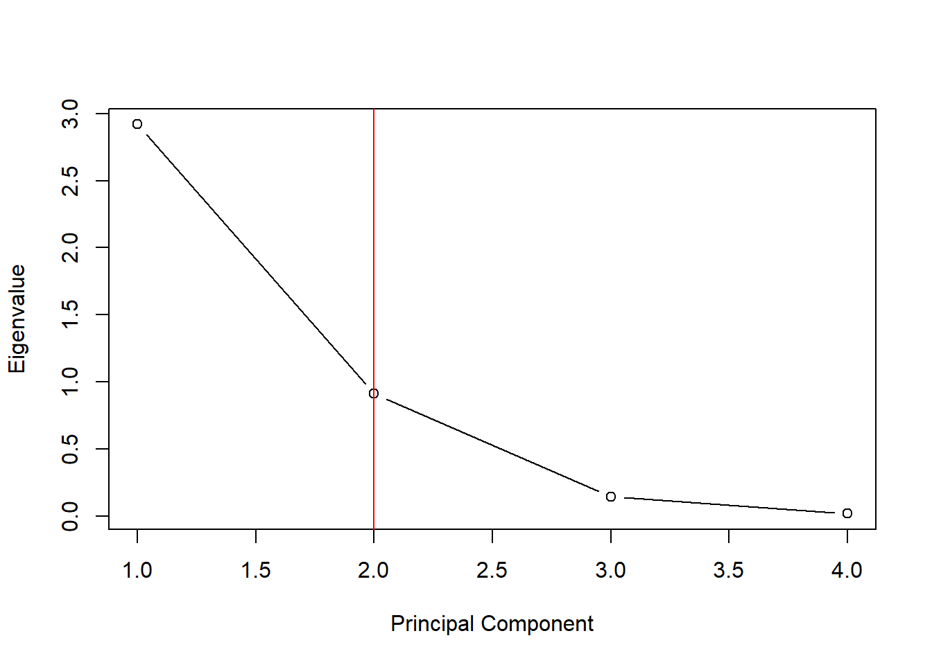
A scree plot is a line plot that shows the eigenvalues or variance explained by each principal component (PC) in a Principal Component Analysis (PCA). It is a useful tool for determining the number of PCs to retain in a PCA model.
In this blog post, we will show you how to create a scree plot in base R. We will use the iris dataset as an example.
Step 1: Load the dataset and prepare the data
E Step 2: Perform Principal Component Analysis
# Perform PCA on the iris dataset
pca <- prcomp(df, scale = TRUE)
E Step 3: Create the scree plot
# Extract the eigenvalues from the PCA object
eigenvalues <- pca$sdev^2

# Create a scree plot
plot(eigenvalues, type = "b",
     xlab = "Principal Component",
     ylab = "Eigenvalue")

# Add a line at y = 1 to indicate the elbow
abline(v = 2, col = "red")
# Percentage of variance explained
plot(eigenvalues/sum(eigenvalues), type = "b",
     xlab = "Principal Component",
     ylab = "Percentage of Variance Explained")
abline(v = 2, col = "red")
Interpretation
The scree plot shows that the first two principal components explain the most variance in the data. The third and fourth principal components explain much less variance.
Based on the scree plot, we can conclude that the first two principal components are sufficient for capturing the most important information in the data.
Here are the eigenvalues and the percentage explained
eigenvalues[1] 2.91849782 0.91403047 0.14675688 0.02071484eigenvalues/sum(eigenvalues)[1] 0.729624454 0.228507618 0.036689219 0.005178709Try it yourself
Try creating a scree plot for another dataset of your choice. You can use the same steps outlined above.
Here are some additional tips for creating scree plots:
- If you are using a dataset with a large number of variables, you may want to consider scaling the data before performing PCA. This will ensure that all of the variables are on the same scale and that no one variable has undue influence on the results.
- You can also add a line to the scree plot at y = 1 to indicate the elbow. The elbow is the point where the scree plot begins to level off. This is often used as a heuristic for determining the number of PCs to retain.
- Finally, keep in mind that the interpretation of a scree plot is subjective. There is no single rule for determining the number of PCs to retain. The best approach is to consider the scree plot in conjunction with other factors, such as your research goals and the specific dataset you are using.