# Sample data
x <- c(1, 10, 100, 1000)
y <- c(0.1, 1, 10, 100)

# Create a log-log plot
plot(x, y, log = "xy", main = "Log-Log Plot Example",
     xlab = "X (log scale)", ylab = "Y (log scale)")
Steven P. Sanderson II, MPH
October 27, 2023
A log-log plot is a type of graph where both the x-axis and y-axis are in logarithmic scales. This is particularly useful when dealing with data that spans several orders of magnitude. By taking the logarithm of the data, we can compress large values and reveal patterns that might be hidden on a linear scale.
Let’s start with a simple example using base R.
# Sample data
x <- c(1, 10, 100, 1000)
y <- c(0.1, 1, 10, 100)
# Create a log-log plot
plot(x, y, log = "xy", main = "Log-Log Plot Example",
xlab = "X (log scale)", ylab = "Y (log scale)")
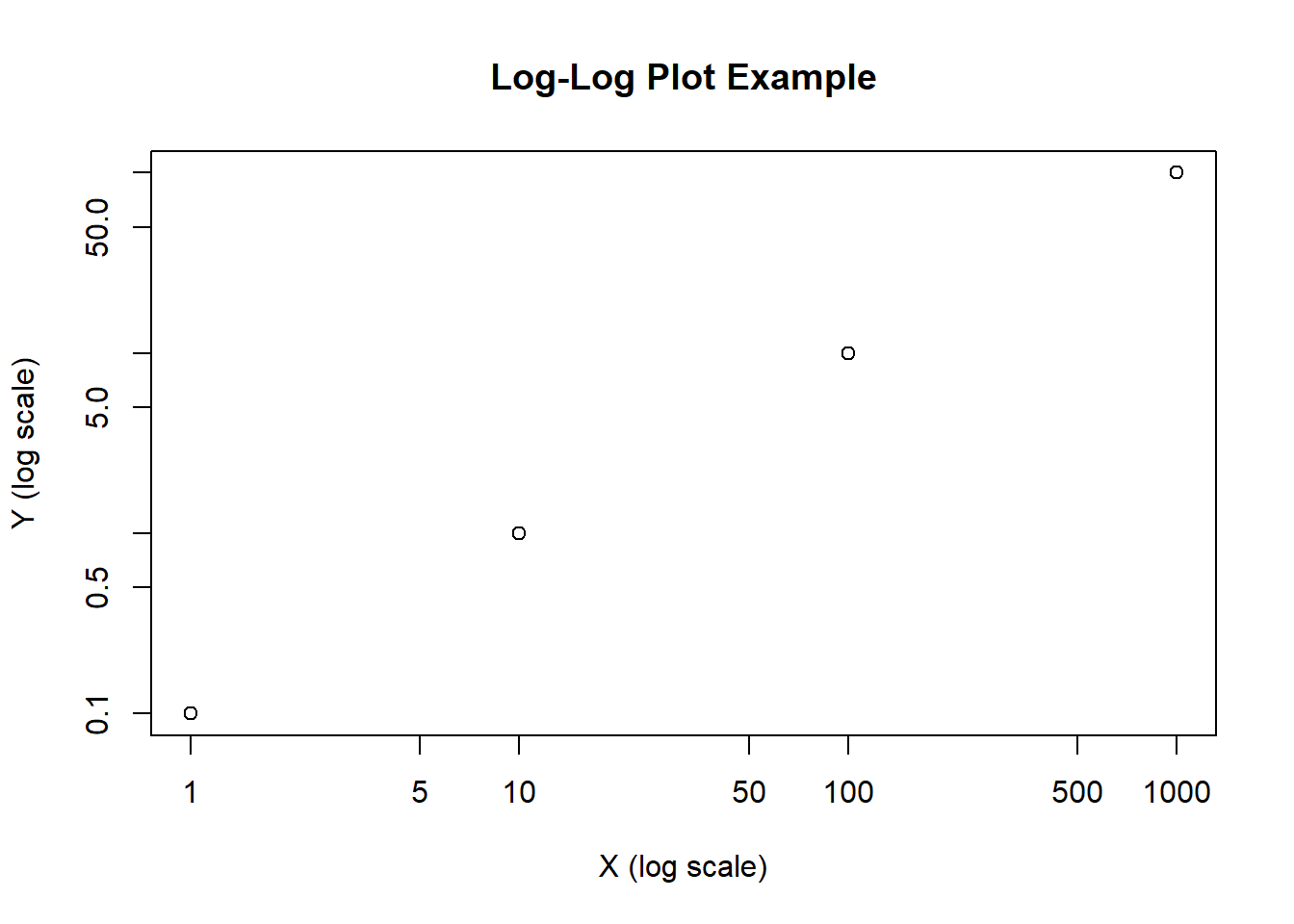
In this code, we create a scatter plot with log scales for both the x and y-axes using the plot function. The log = "xy" argument specifies that both axes should be in logarithmic scale. This makes it easier to visualize the relationship between x and y.
Let’s say you have data for a power law relationship, where y is proportional to x raised to a power. A log-log plot can help you confirm this relationship.
# Generate data for a power law relationship
x <- 1:10
y <- 2 * x^2

# Create a log-log plot
plot(x, y, log = "xy", type = "b", pch = 19, col = "blue",
     main = "Log-Log Plot for Power Law", xlab = "X (log scale)", ylab = "Y (log scale)")
Here, we generate data for a power law relationship (y = 2 * x^2) and create a log-log plot. The type = "b" argument adds both points and lines, making the plot easier to interpret. You can see that on a log-log scale, this power law relationship appears as a straight line.
You can further customize your log-log plots with various options.
# Customizing a log-log plot
x <- c(1, 10, 100, 1000)
y <- c(0.1, 1, 10, 100)

plot(x, y, log = "xy", main = "Custom Log-Log Plot",
     xlab = "X (log scale)", ylab = "Y (log scale)",
     xlim = c(0.1, 1000), ylim = c(0.1, 100), col = "red", pch = 15)

# Adding grid lines
grid()

# Adding a trendline (linear regression)
abline(lm(log10(y) ~ log10(x)), col = "blue")
In this example, we customize the log-log plot by setting axis limits, changing the point color and type, adding grid lines, and even fitting a trendline using linear regression.
Log-log plots are powerful tools for visualizing data, especially when dealing with a wide range of values. I encourage you to try creating log-log plots with your own datasets. It’s an excellent way to gain insights into your data and discover underlying patterns that may not be apparent on a linear scale.
Remember, the key is to use the log argument with “xy” to set both axes to logarithmic scales. Experiment with different types of data and customize your plots to make them more informative and engaging. Happy plotting!