library(tidyAML)
library(recipes)

# Define the recipe
rec_obj <- recipe(mpg ~ ., data = mtcars)

# Train the model
frt_tbl <- fast_regression(
  mtcars,
  rec_obj
)
Setting default kernel parameters
Setting default kernel parameters Steven P. Sanderson II, MPH
March 15, 2024
In the realm of machine learning, visualizing model predictions is essential for understanding the performance and behavior of our algorithms. When it comes to regression tasks, plotting predictions alongside actual values provides valuable insights into how well our model is capturing the underlying patterns in the data. With the plot_regression_predictions() function in tidyAML, this process becomes seamless and informative.
plot_regression_predictions()The plot_regression_predictions() function is a powerful tool for visualizing regression predictions in R. Developed as part of the tidyAML package, it leverages the capabilities of ggplot2 to create insightful plots that compare actual values with model predictions, both for training and testing datasets.
Let’s break down the syntax and arguments of plot_regression_predictions():
.data: This argument takes the data from the output of the extract_regression_residuals() function..output: By default, this argument is set to “list”, which returns a list of plots. Alternatively, you can choose “facet”, which returns a single faceted plot.To illustrate how plot_regression_predictions() works in practice, let’s consider an example using the mtcars dataset and a simple linear regression model.
library(tidyAML)
library(recipes)
# Define the recipe
rec_obj <- recipe(mpg ~ ., data = mtcars)
# Train the model
frt_tbl <- fast_regression(
mtcars,
rec_obj
) Setting default kernel parameters
Setting default kernel parameters In this example, we’ve created a recipe for predicting mpg based on other variables in the mtcars dataset. We then trained a fast regression model using fast_regression() from the recipes package.
Now, let’s use extract_wflw_pred() to extract the predictions:
# A tibble: 6 × 4
  .model_type     .data_category .data_type .value
  <chr>           <chr>          <chr>       <dbl>
1 lm - linear_reg actual         actual       15.2
2 lm - linear_reg actual         actual       30.4
3 lm - linear_reg actual         actual       21.4
4 lm - linear_reg actual         actual       33.9
5 lm - linear_reg actual         actual       19.7
6 lm - linear_reg actual actual 10.4 [1] "lm - linear_reg" "brulee - linear_reg"
[3] "glm - linear_reg" "stan - linear_reg"
[5] "dbarts - bart" "xgboost - boost_tree"
[7] "rpart - decision_tree" "earth - mars"
[9] "nnet - mlp" "brulee - mlp"
[11] "kknn - nearest_neighbor" "ranger - rand_forest"
[13] "randomForest - rand_forest" "LiblineaR - svm_linear"
[15] "kernlab - svm_linear" "kernlab - svm_poly"
[17] "kernlab - svm_rbf" With the predictions extracted, we can now plot the regression predictions using plot_regression_predictions():
# Plot regression predictions
extract_wflw_pred(frt_tbl, 1:6) |>
  plot_regression_predictions(.output = "facet")
[[1]]
[[2]]
[[3]]
[[4]]
[[5]]
[[6]]
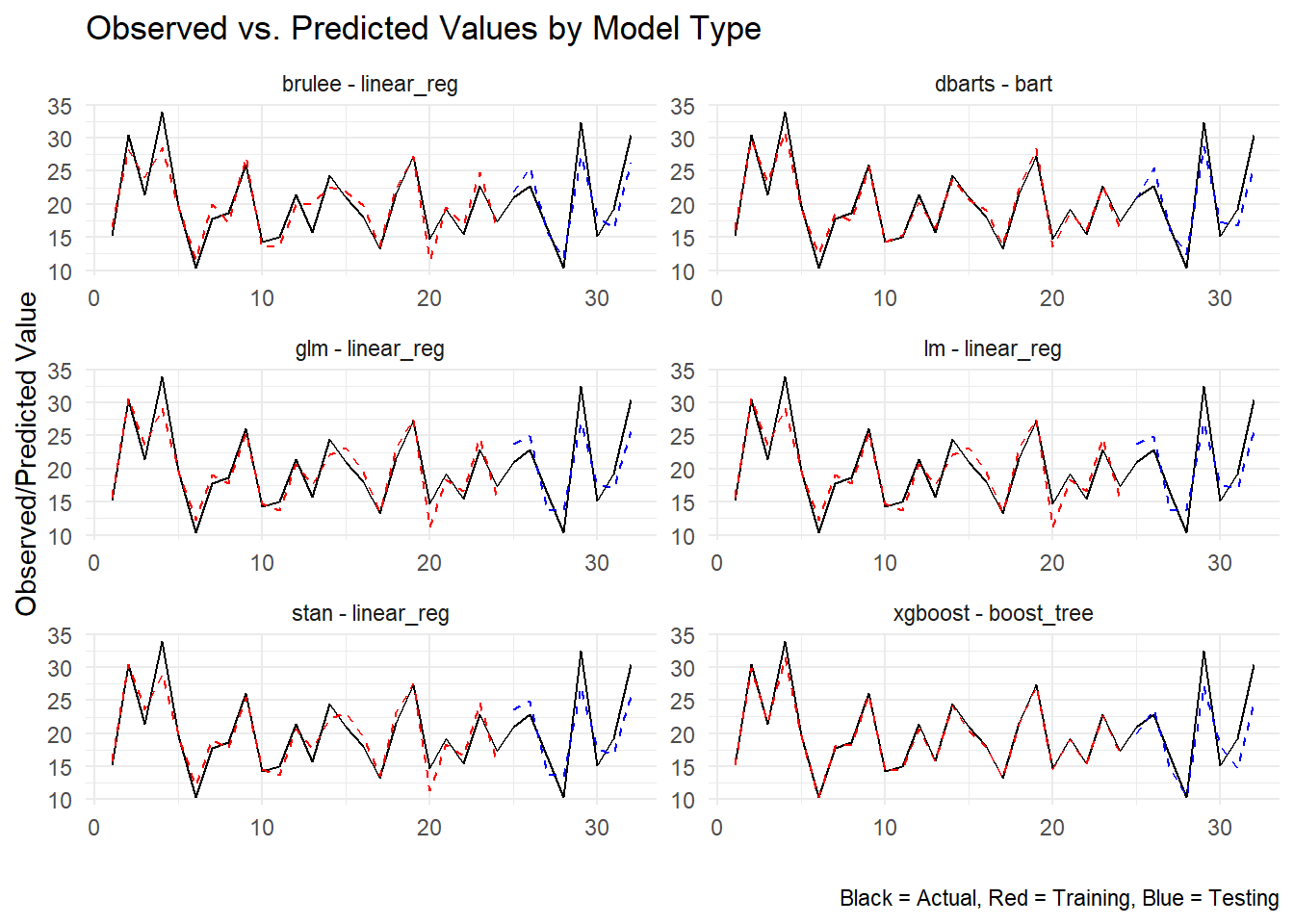
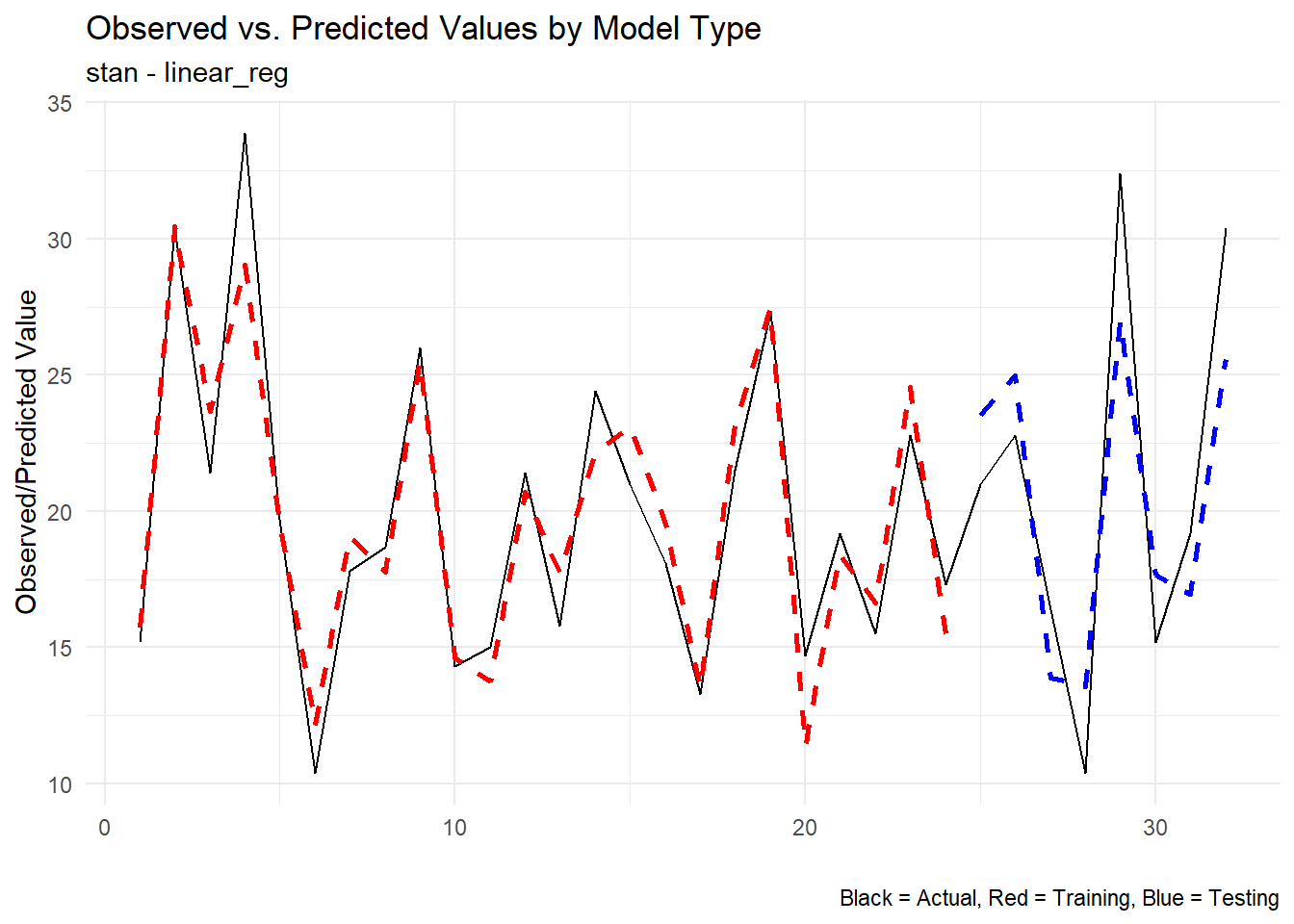
This will generate a set of plots comparing actual values with model predictions for both the training and testing datasets.
The plots produced by plot_regression_predictions() offer valuable insights into the performance of our regression model. Here’s what you can expect to see:
Actual vs. Predicted Values: The main plot compares the actual values (y-axis) with the predicted values also (y-axis). This allows you to see how the model performs across the range of observed values both in training and in testing.
Training vs. Testing: If you choose the “facet” output option, you’ll see separate plots for training and testing data sets by model type.
In summary, plot_regression_predictions() is a valuable tool for visualizing regression predictions in R. Whether you’re assessing model performance, diagnosing errors, or communicating results to stakeholders, these plots provide a clear and intuitive way to understand how well your model is capturing the underlying patterns in the data. So next time you’re working on a regression task with tidyAML, don’t forget to leverage the power of visualization with plot_regression_predictions()!